MÚN
MATCHA & TEA
Design Brief
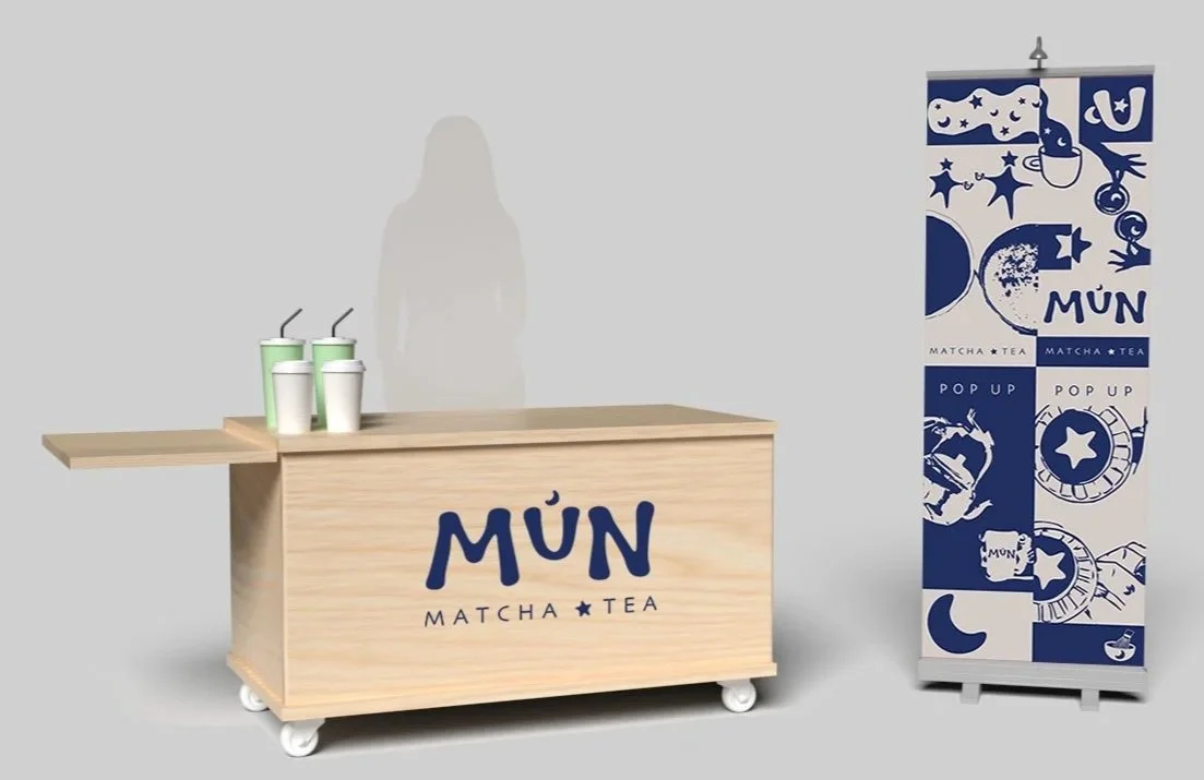
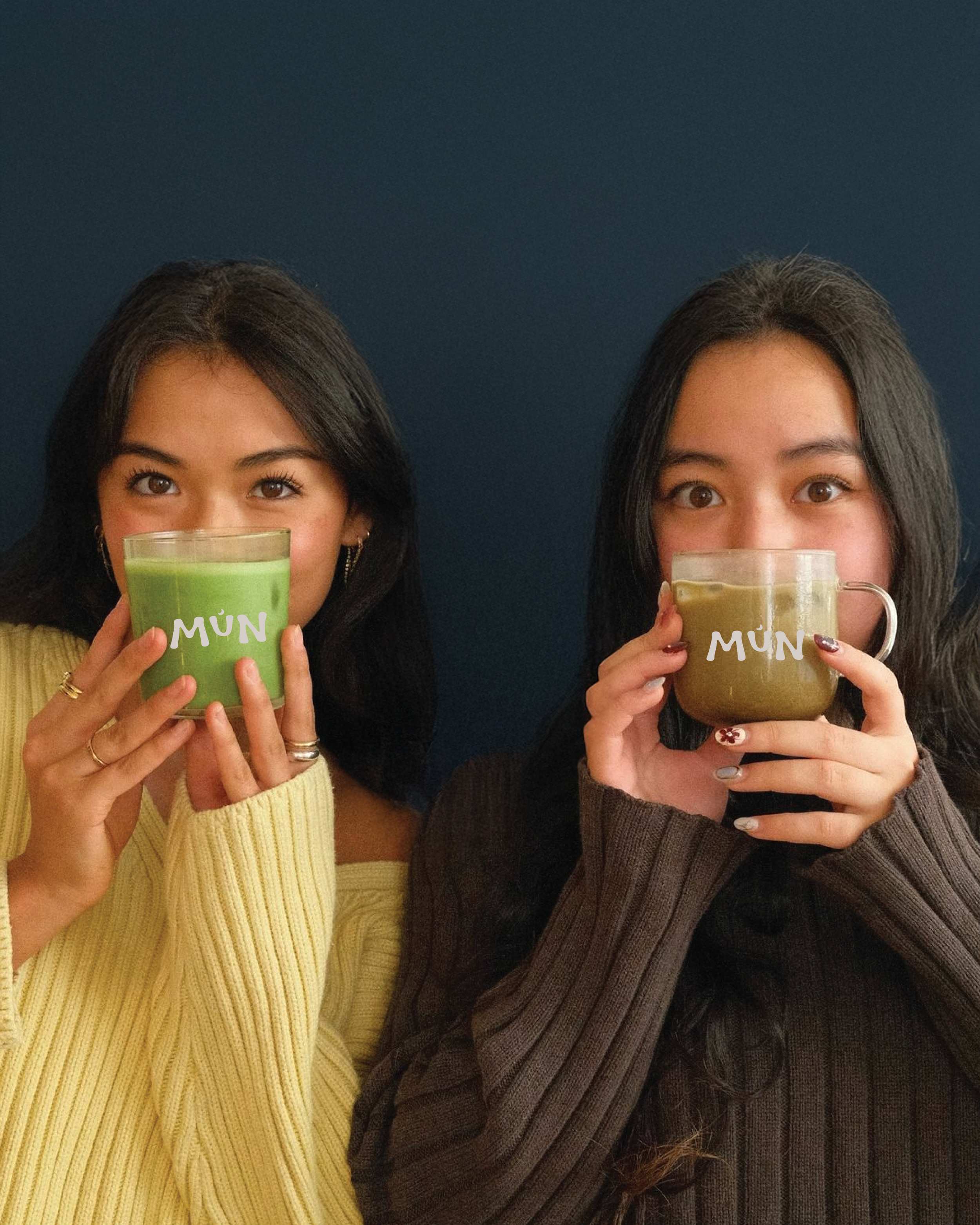
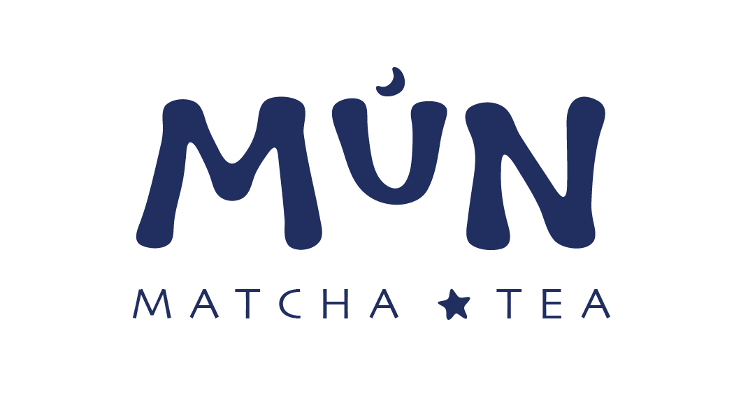
When creating the brand for Mún, I aimed to balance minimal and expressive design to make the identity both distinctive and approachable. The logo was designed to stand on its own without subtext, supporting the clean and minimal aesthetic. To convey the homemade feel, I developed a hand-drawn typeface for “Mún,” paired with a Japanese-inspired sans serif for the subtext to create contrast and unity. The color palette draws from the Somali flag, using deep blue and soft beige instead of stark white, with earthy accent tones. The hand-drawn qualities of the letterforms extend into the icons and imagery, creating cohesion across the entire brand system

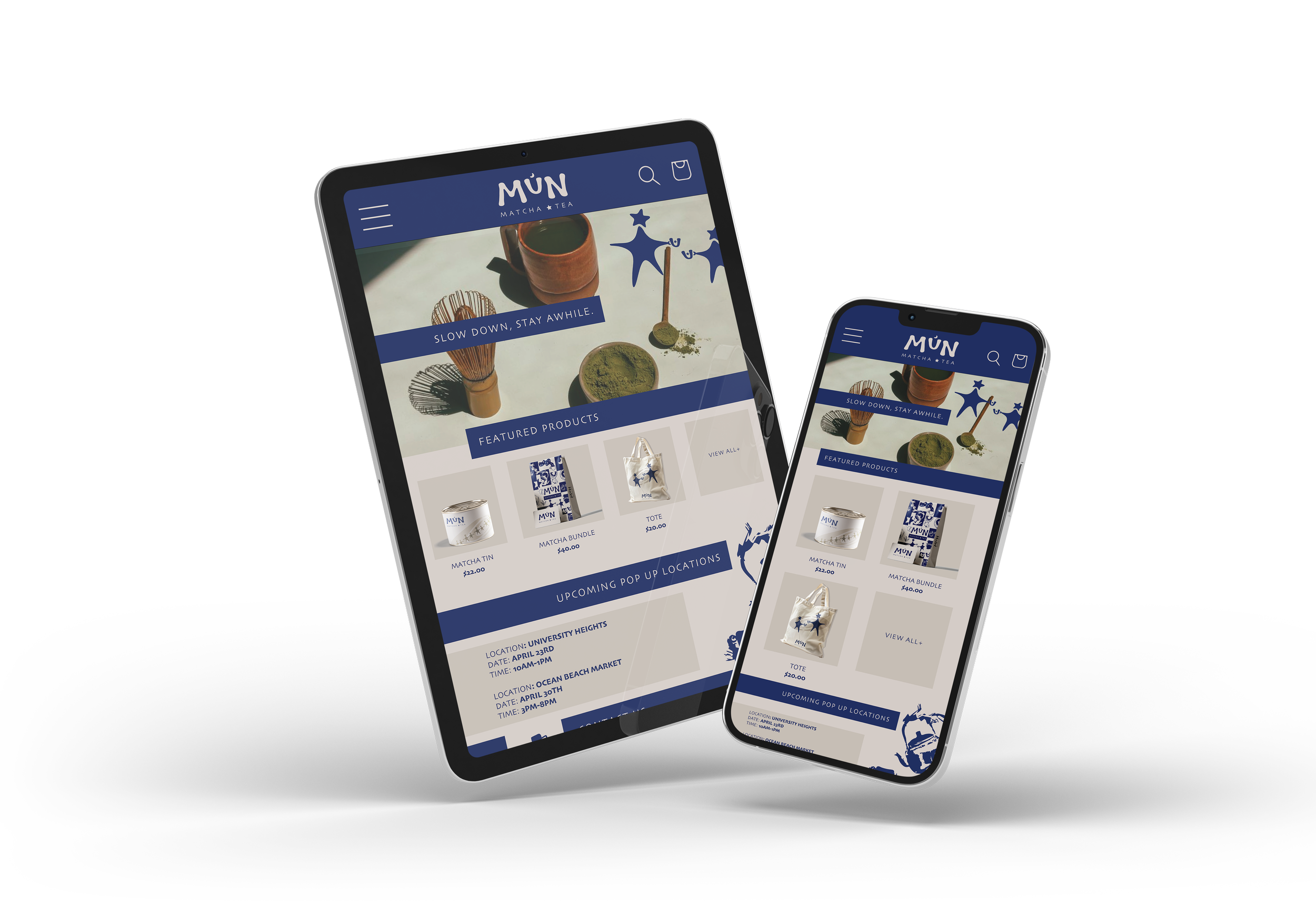
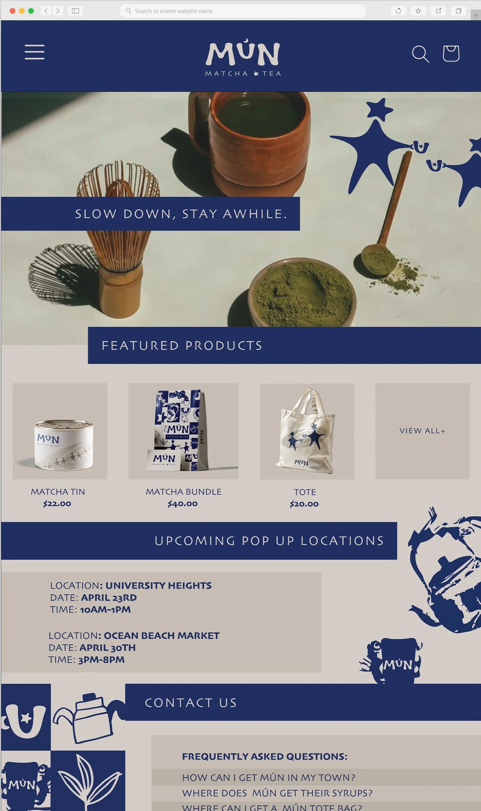
Responsive web screens
The website design translates the brand into a digital experience that feels calm, inviting, and easy to navigate. I used a clean, structured layout with strong horizontal sections to guide the user through the page while maintaining a minimal aesthetic. The deep blue header and soft beige background create consistency with the brand palette, while photography and subtle hand-drawn elements add warmth and personality. The design prioritizes clarity by highlighting featured products and upcoming pop-ups, while still reflecting the brand’s focus on slowing down and creating a sense of community.
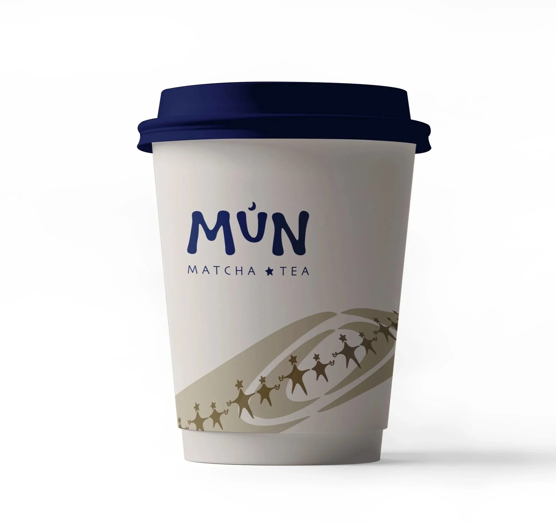
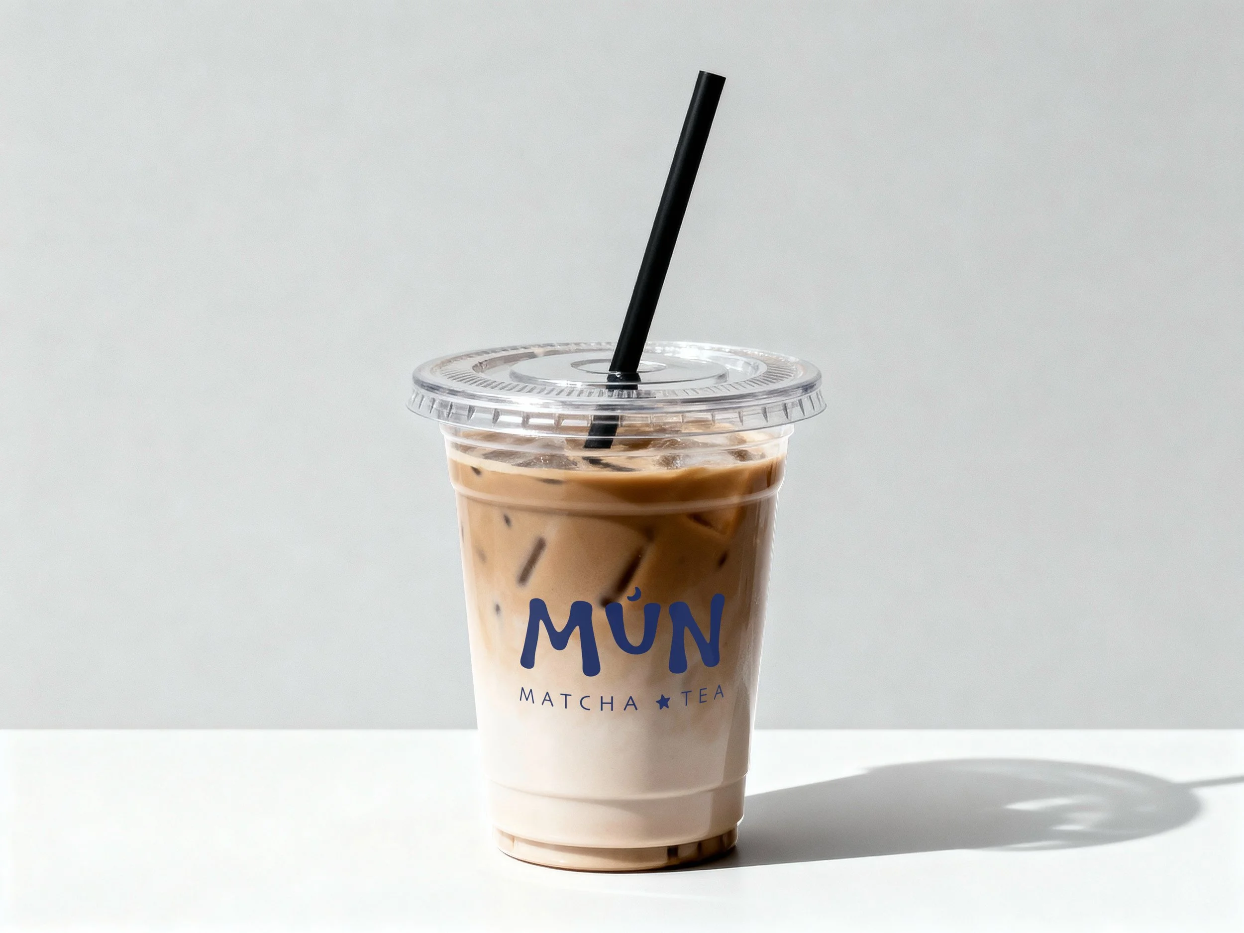
Cup Design
For the cups, the design for the clear cups is intentionally minimal, using a large centered logo to highlight the drink itself. The hot cups introduce subtle, logo-inspired illustrations that suggest connection and shared experience, reinforcing the brand’s focus on community while keeping the identity clean and recognizable.
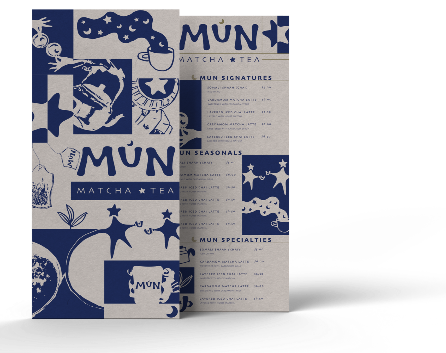
Menu
The menu design expands on the brand’s expressive minimalism through a grid-based layout that balances structure and play. The back features a collage of icons and imagery that reflect community and cultural influence, while the front maintains a more minimal, type-focused layout for clarity.
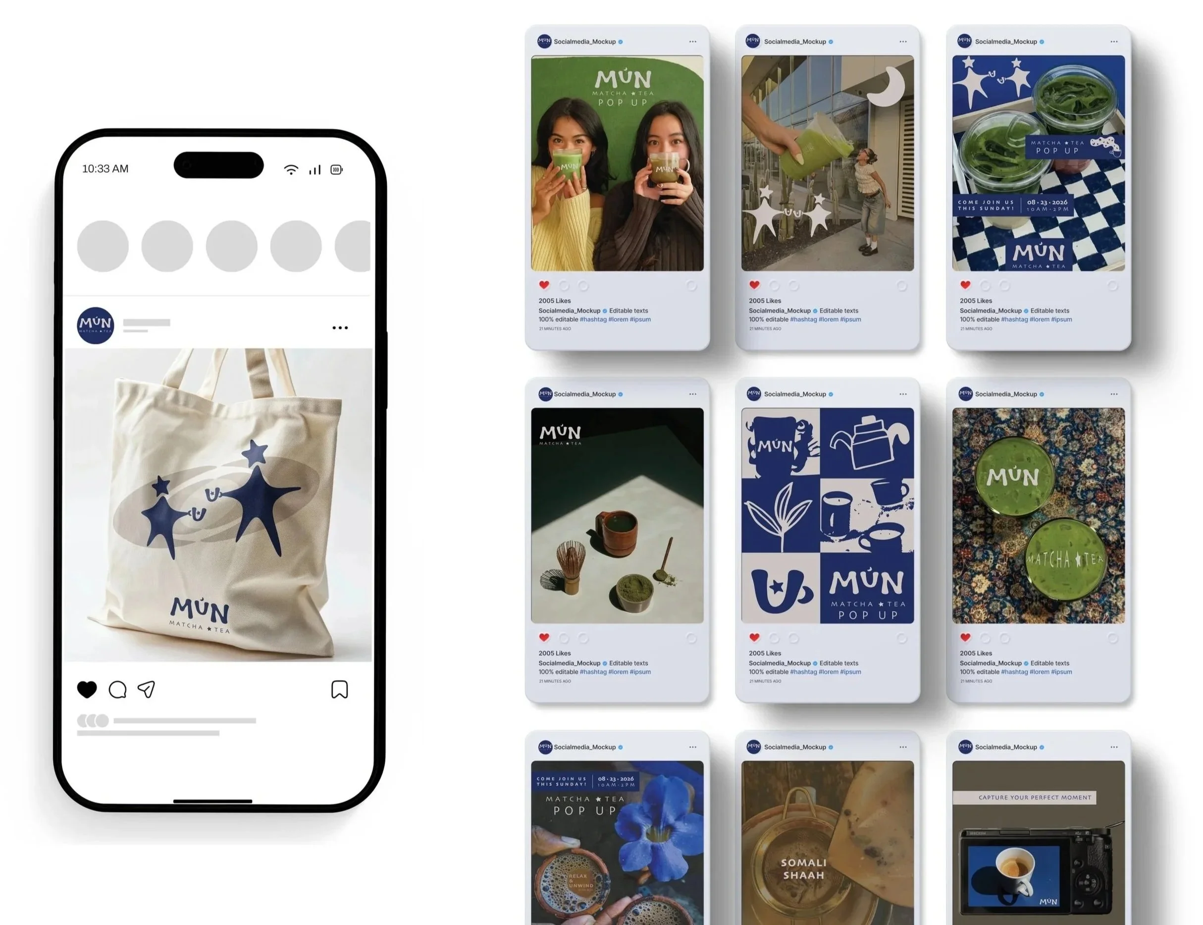
Social Media
The social media posts extend the brand by combining minimal layouts with more expressive imagery to create visual variety while staying cohesive. Each post uses the established color palette of deep blue, soft beige, and earthy tones, ensuring the content feels consistent across different formats. I incorporated hand-drawn elements and logo-inspired forms to reinforce the brand's homemade, community-driven feel. Some posts lean more toward minimalism with a strong typographic focus, while others highlight photography and texture to showcase the product and atmosphere, creating a balance between clarity and personality while keeping the brand engaging across different content types. The tote bag extends the brand into a functional, everyday object while maintaining its minimalist and hand-crafted identity. It features the same hand-drawn typography and simple graphic elements, allowing it to act as both a practical item and a subtle, recognizable piece of the brand.