MÚN MATCHA & TEA
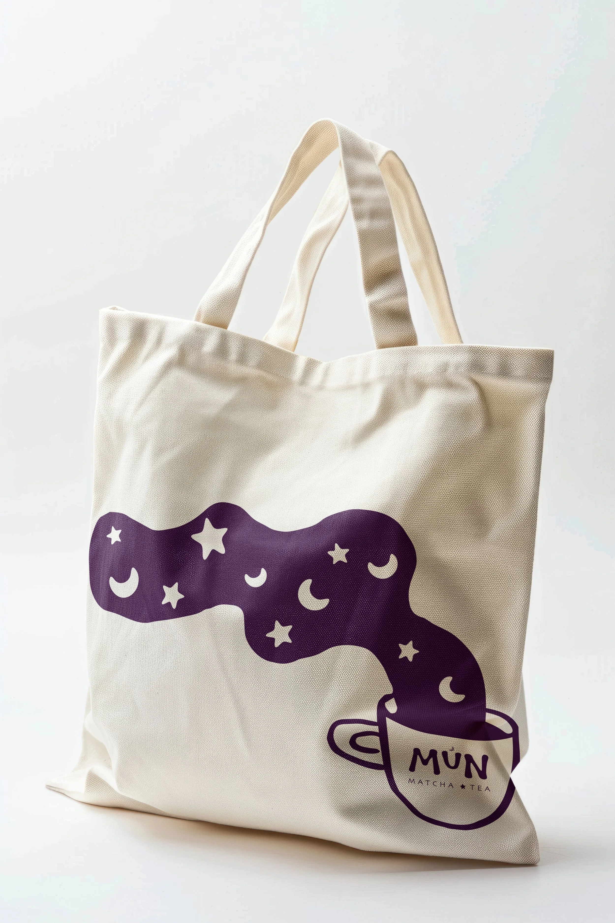
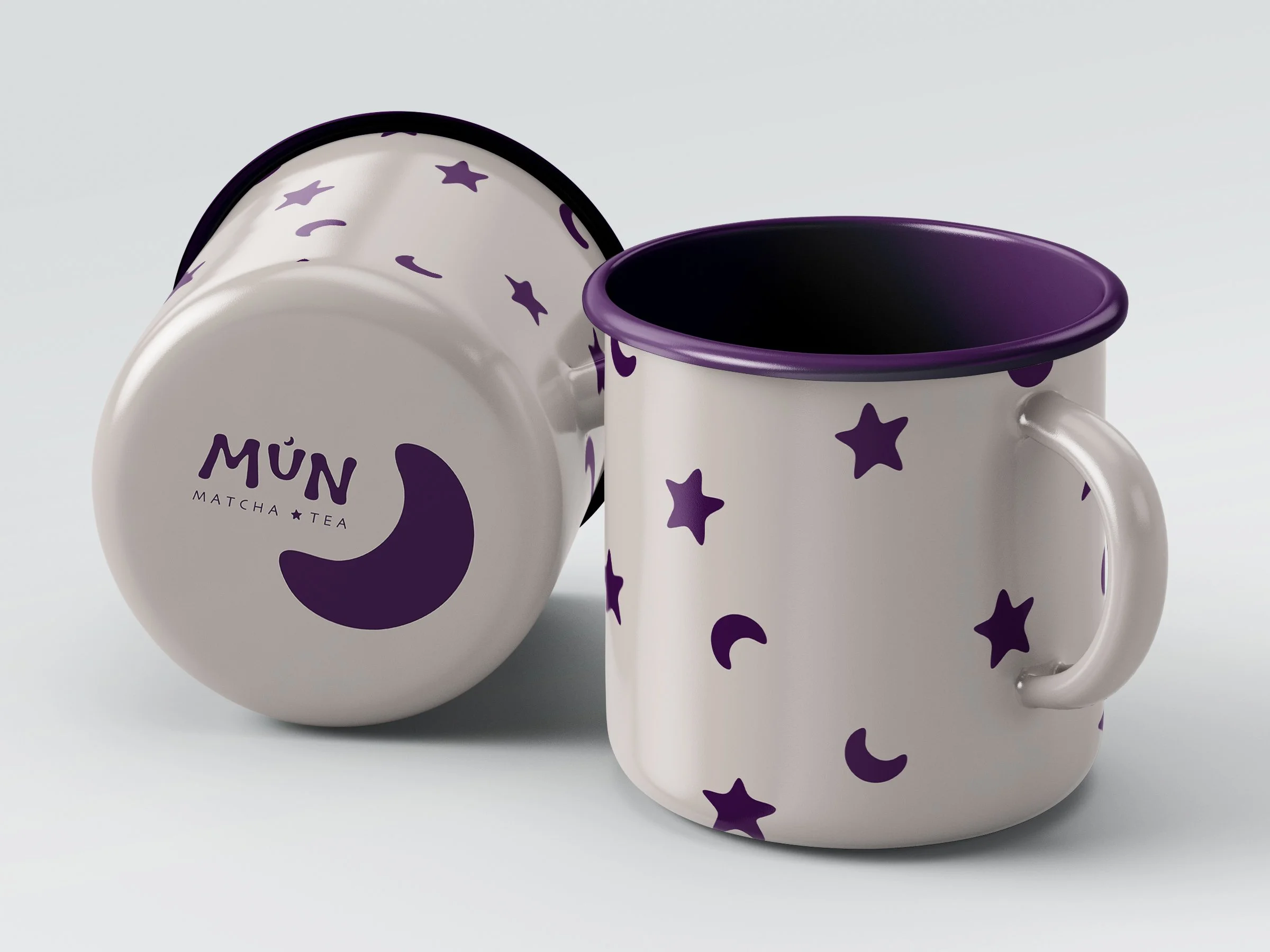
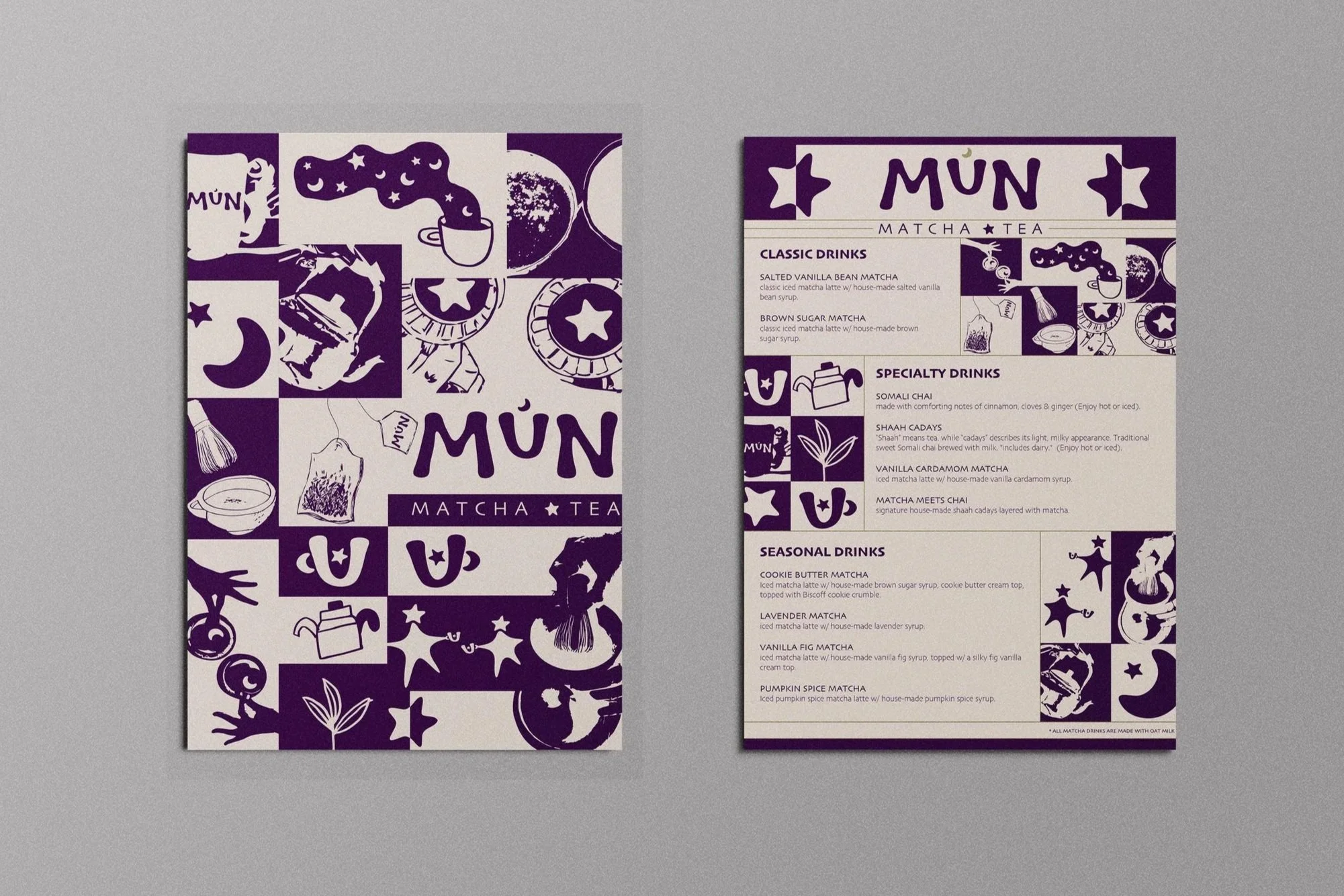
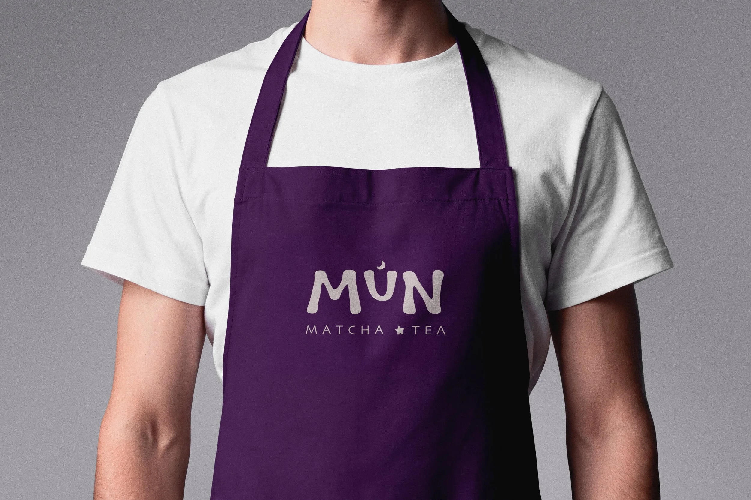
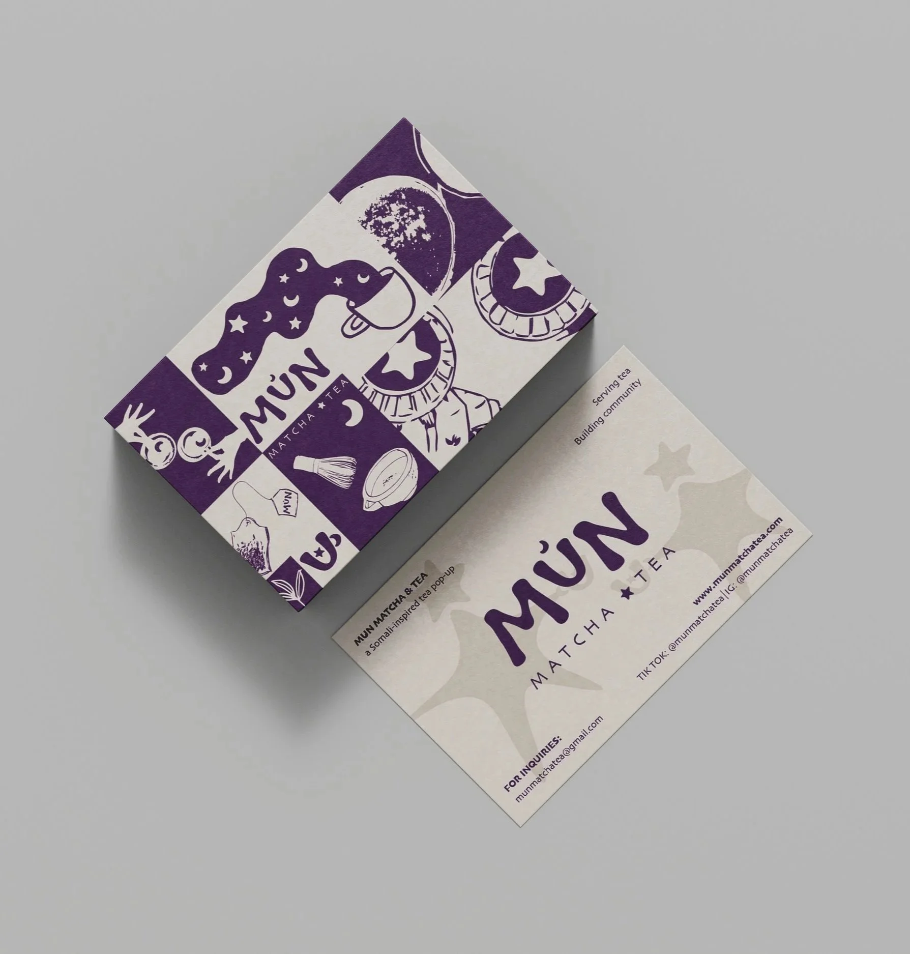
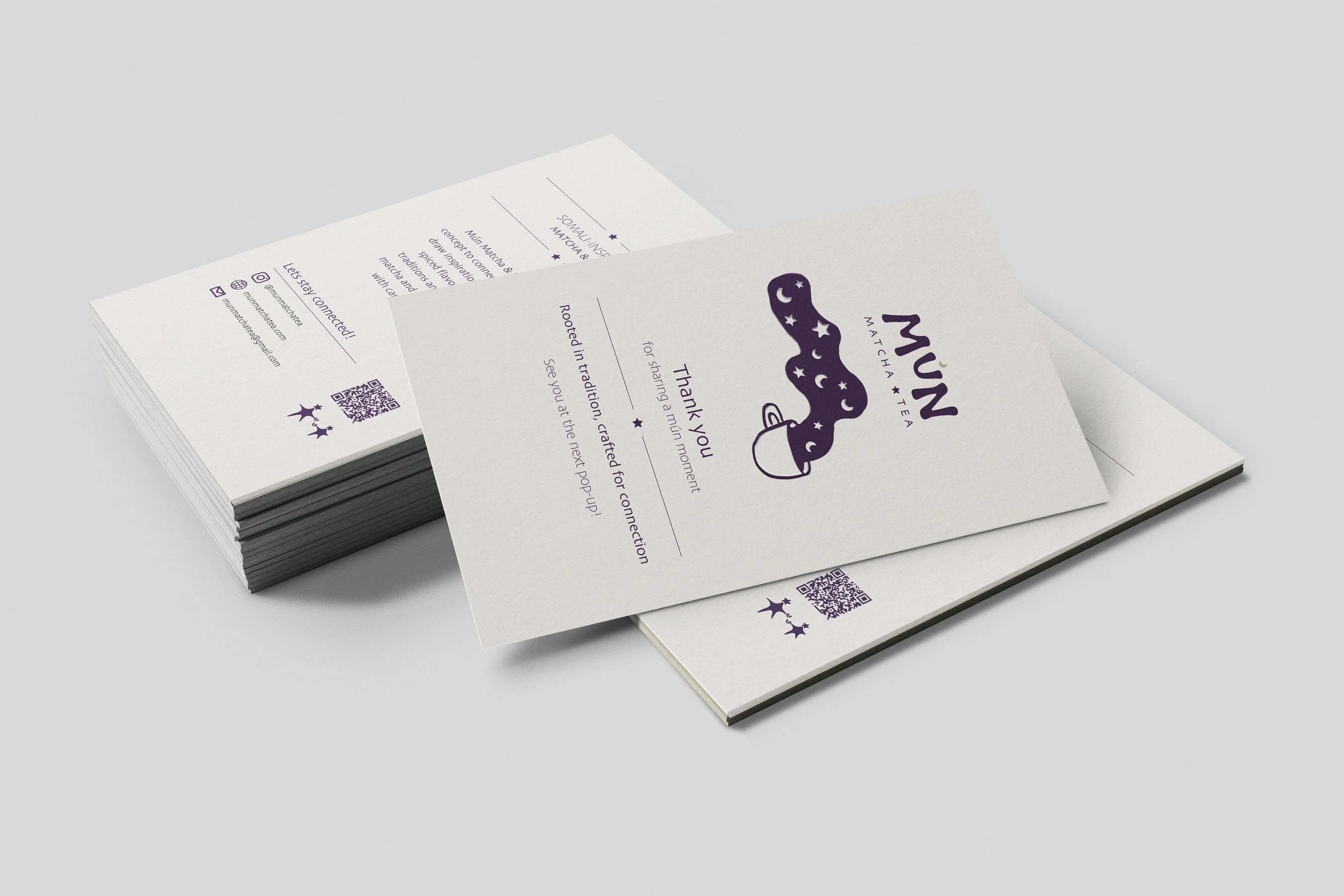
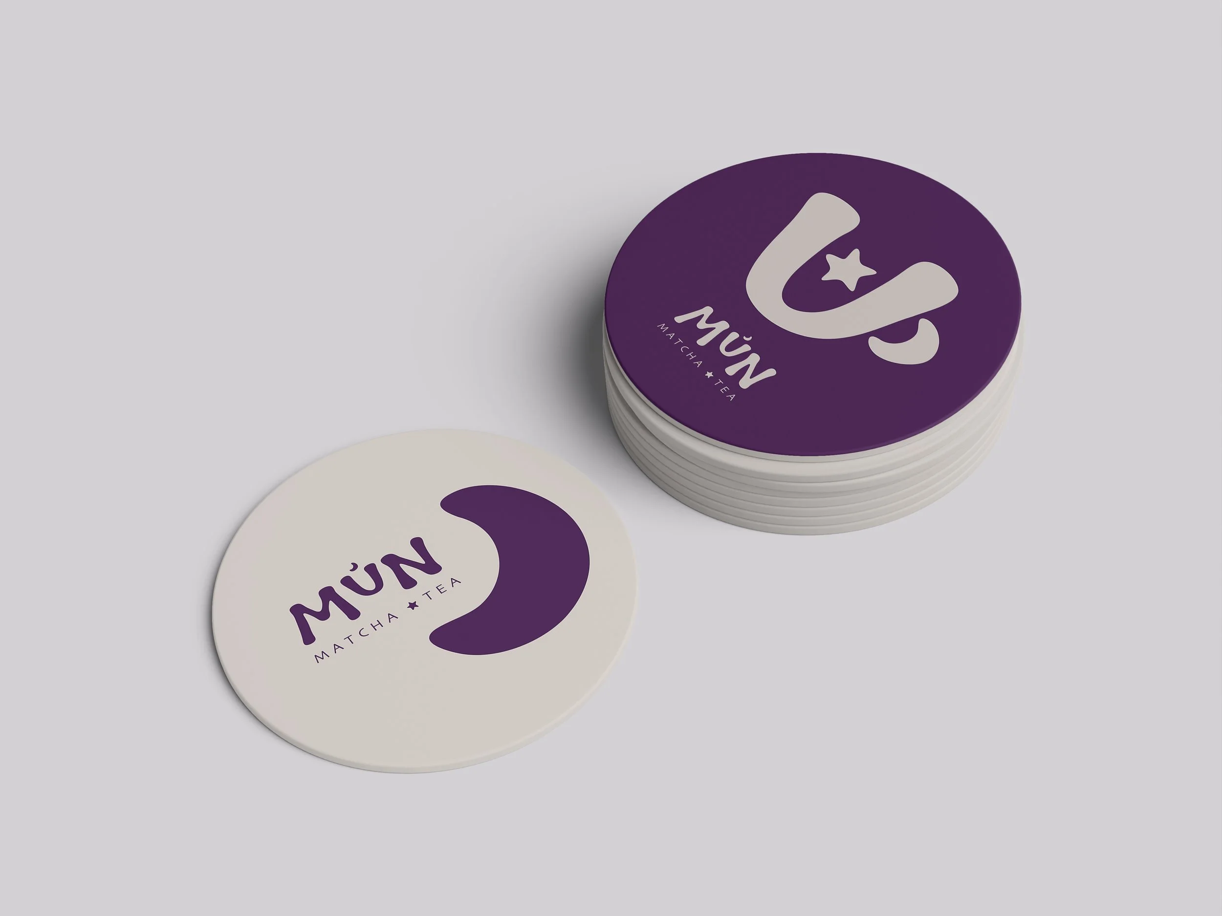
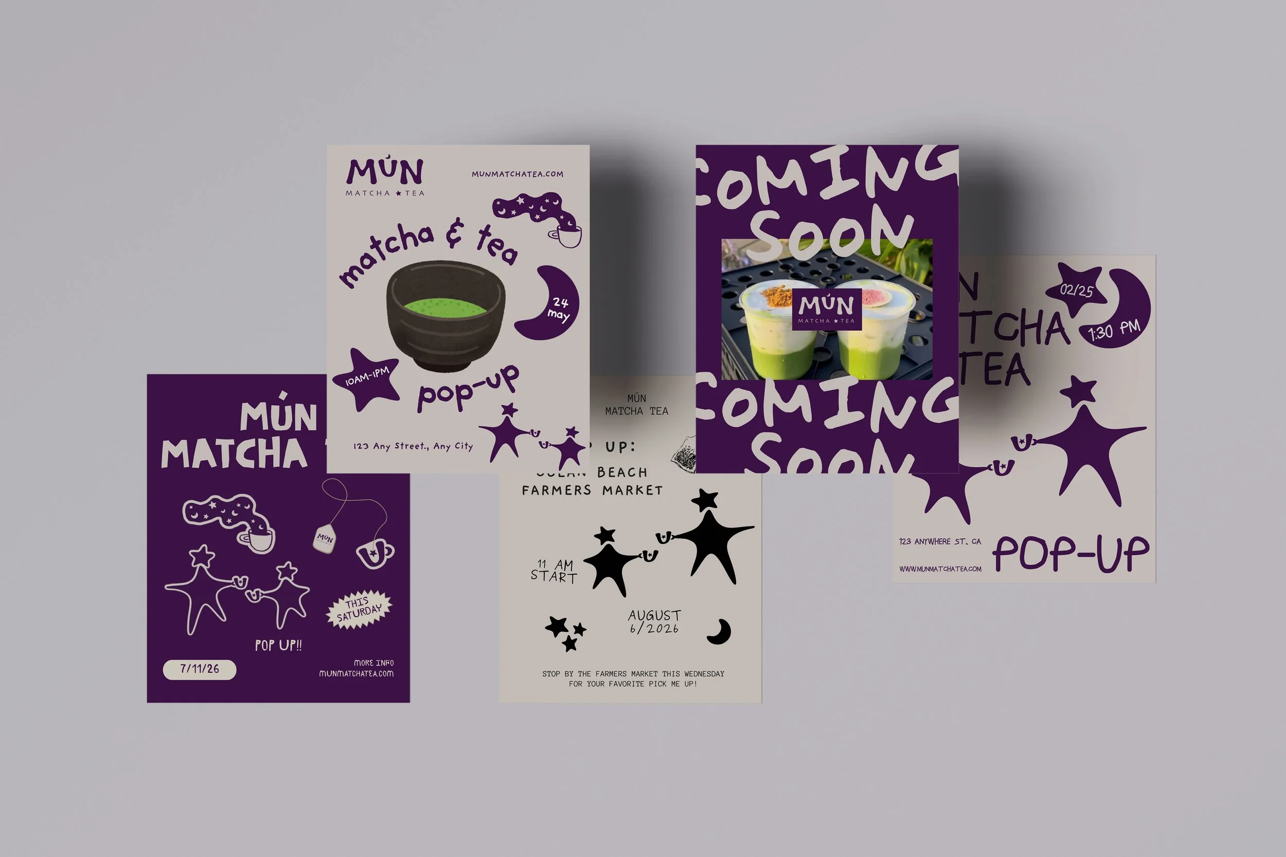
Mún Matcha & Tea is a Somali- and Japanese-inspired beverage brand centered around matcha, chai, and community. I developed a complete visual identity that blends minimal typography, expressive hand-drawn elements, and a rich purple-and-neutral color palette to reflect both cultural influences in a modern way. The system was extended across packaging, menus, social media, merchandise, and digital touchpoints to create a cohesive and recognizable brand experience.


Serving tea. Building community.

To convey the homemade feel, I developed a hand-drawn typeface for “Mún,” paired with a Japanese-inspired sans serif for the subtext to create contrast and unity. The color palette draws from the Somali flag, using deep blue and soft beige instead of stark white, with earthy accent tones. The hand-drawn qualities of the letterforms extend into the icons and imagery, creating cohesion across the entire brand system