0
Skip to Content
Contact
About
Projects
Open Menu
Close Menu
Contact
About
Projects
Open Menu
Close Menu
Contact
About
Projects
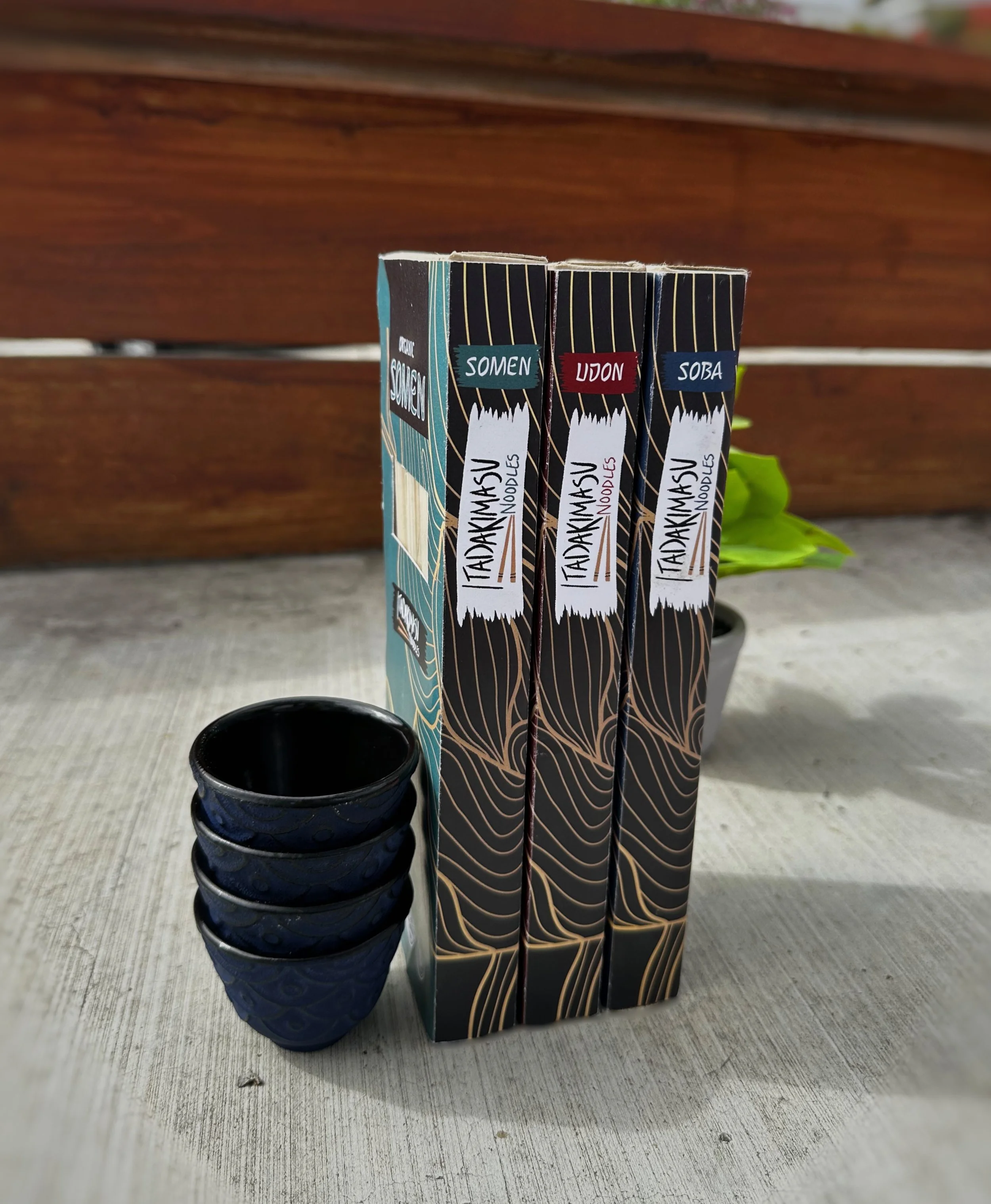
Itadakimasu
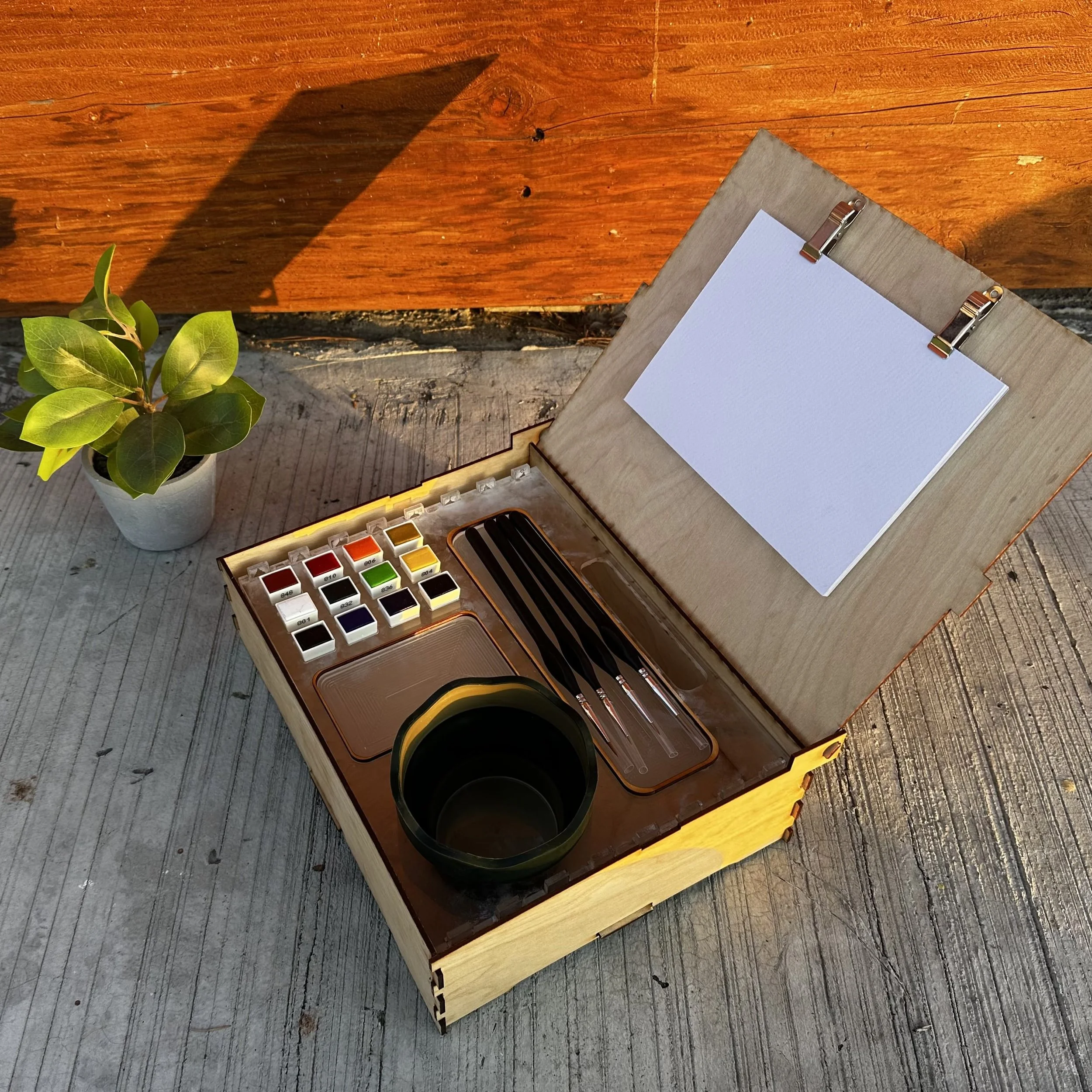
Studio
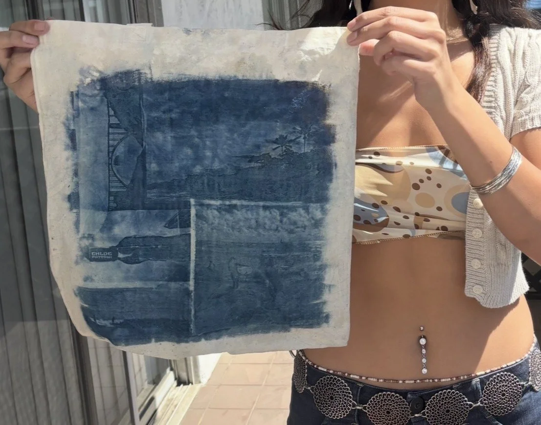
Cyanotypes
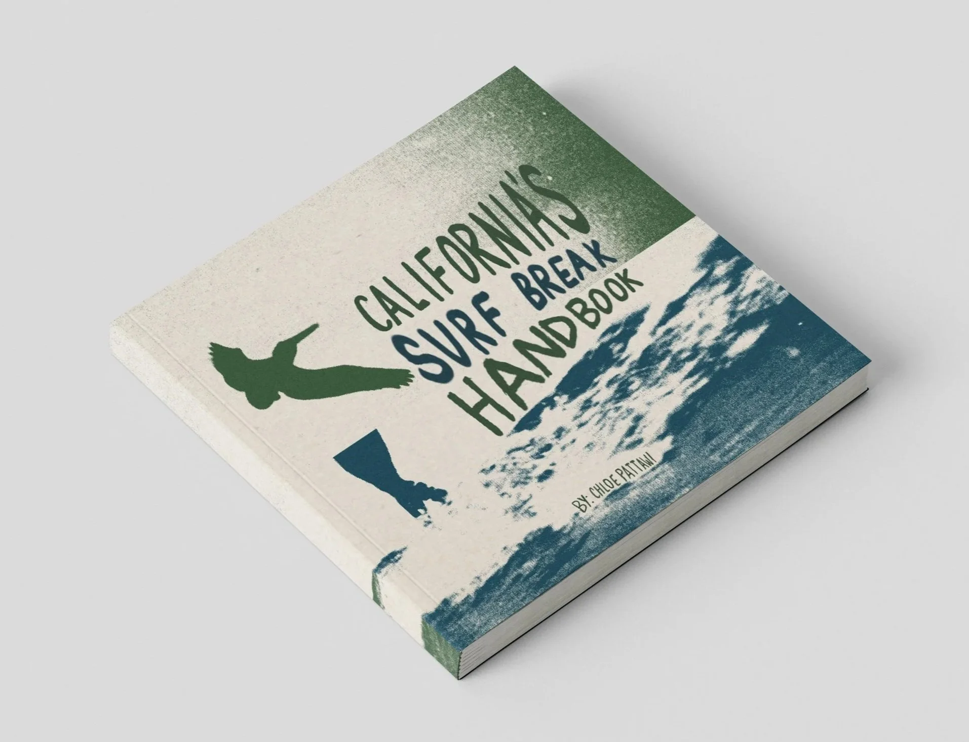
SUrf break Handbook
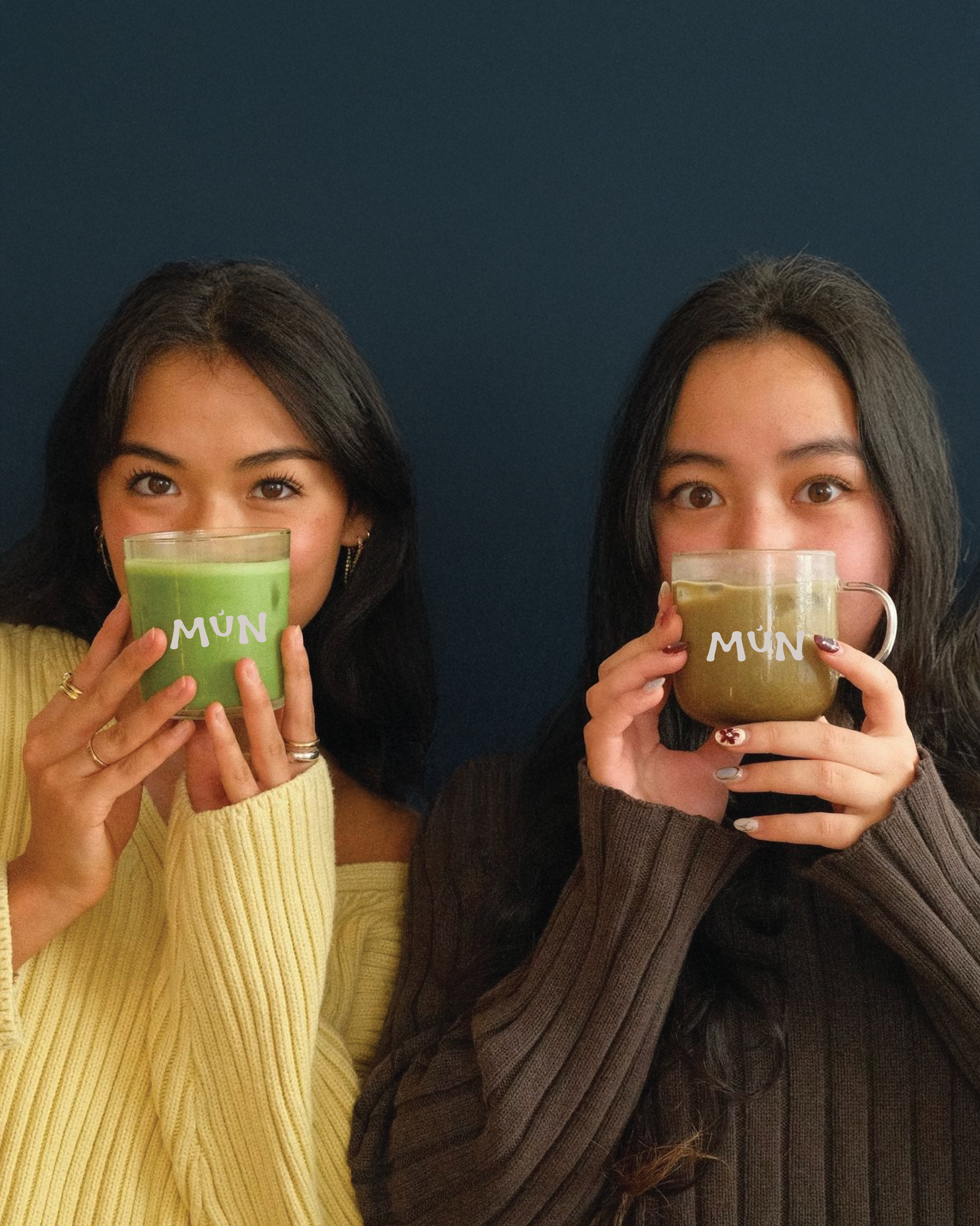
MÚn
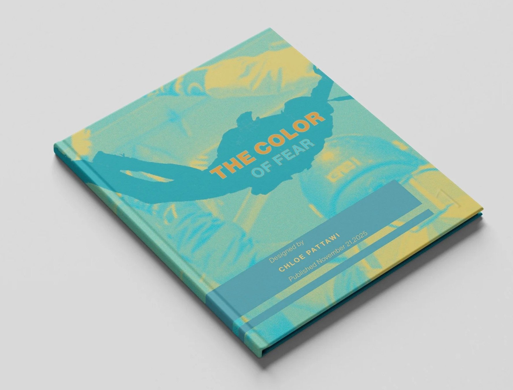
the color of fear